Image if you walk into a grocery store and the shelves are fully stocked with plainly packaged food; just rows of plain bags of chips and boxes of cereal with no indicator of who actually made the product. Instead, the bags of potato chips are seemingly indistinguishable from the next, and there are no cartoon mascots dancing on the cereal boxes- Lay’s and Kelloggs seemingly do not exist.
Not only does this make the endless shelves look remarkably dull, but it also begs the question, how can you find your favorite flavor of chips or cereal? Without businesses ‘branding’ their product, it inhibits the consumers’ ability to recognize their product. Now think about this on a larger scale, from Caribou vs Starbucks coffee to Apple vs Android phones to Ford vs Toyota trucks, what if none of these had their distinguishable logo? There was no green mermaid on your coffee cup, a crisp apple on your phone, or a blue oval stamped on your truck. A logo is the business’ representation of their products or services that holds not only a visual value but signifies additional brand qualities, which demonstrates why logos are an essential aspect of a business.
What makes an effective logo design? The four functions
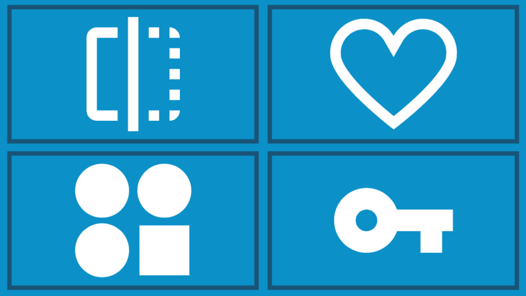
As described, a logo has many more functions than just being displayed on the front of your building or at the top of your website. A good logo design will reflect your business, resonate with your audience, differentiate your brand, and indicate ownership.
1. Reflects your business
What is your business’ voice, mission, vision, etc.? A good logo will encompass those values. As an extension of your business, the logo is the expression of your brand.
2. Resonates with your audience
A logo does not need to appeal to everyone, it only needs to resonate with your audience. When your targeted audience can recognize your logo, it contributes to brand awareness, brand recognition, and ultimately, a conversion.
3. Differentiates your brand
Your logo is a tool for proclaiming your business in the industry. It is unique to your business and your business only, allowing your brand to be distinct among competitors.
4. Indicates ownership
A logo clearly indicates who a product or service belongs to or is provided by. You are proud of your product or service, and your logo allows you to clearly take ownership.
What are the elements of a great logo design?
The three primary elements of a great logo design are color, typography, and graphics/shapes.
1. Color

Color has a large impact on how viewers interpret emotions. There are feelings associated with colors that can portray different meanings. For example, when one landscape graphic has a blue sky while the exact same graphic has a gray sky, they hold two very different connotations. Color should be carefully selected based on what emotions or feelings you want the logo to hold.
While typography and graphics are not apparent in all logos, color is constant. From white to black to a rainbow selection, color is always an element of a logo. To learn more about color, click here.
2. Typography
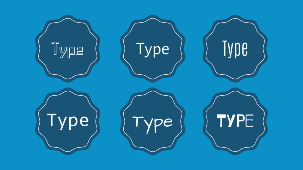
Another element of a logo is typography. While not all logos incorporate typography, instead they may just use graphics or shapes, typography is a powerful component of numerous brands. For example, Amazon’s logo would not be a logo without the careful use of the textual word “Amazon.” Or other famous brand logos such as 3M, Coca-Cola, and The New York Times.
Typography encompasses many strategic considerations such as the font, character size and spacing, boldness or italicized, texture, weight, and format. All these visual components of typography create a design that portrays an accurate and engaging perception of your brand.
3. Graphics and shapes
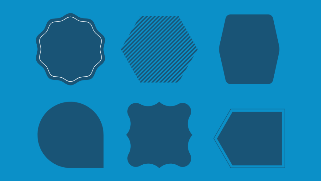
The last element of logos is graphics or shapes. These can vary from a simple line to an intricate design to represent your brand. Graphics are an extremely influential and dynamic aspect of a logo that has the capacity to establish a notable brand logo.
For example, the Nike swoosh may be one of the most well-known logos elevated by its simple yet monumental design. Other graphic-based logos include Target, Apple, and Twitter.
Some examples of logos that incorporate all three elements are MasterCard, Levi’s, and Samsung. They each use color, typography, and shapes in their logo
What makes a great logo? The five qualities
So while we all recognize McDonald’s “M” while driving down the highway or H&M’s bold red text when strolling through the mall, the concept behind why is often not considered. This is actually intended since a brand doesn’t need the consumer to know why they recognize their logo, only that they do. Below are five qualities that construct a great logo design.
1. Balanced and structured

Humans are fundamentally attracted to balance and structure, even if we don’t realize it. For example, you would typically notice when a picture frame is crooked and will adjust it until the frame appears straight. This is because there is an appeal to balance, and in this example when the frame is symmetrical, it is balanced and therefore correct.
Often times in the world of logos, the balance and structure are a lot less apparent or pondered, instead, consumers unconsciously find themselves drawn to these logo designs. Yet as the designer, the logo’s structure was precisely planned to comply with (or purposefully not comply with) the rules of a balanced structure.
2. Remains relevant

Trends are the hip, new things. They are the designs and concepts that seem to dominate the current world. Yet trends often come and go, leaving behind outdated material that was just top of its class a few years prior. Therefore, a logo should remain relevant over the years, not just while the trend exists. While tweaking logos over time is a common practice, the process of rebranding should be a limited occurrence as it can hurt your brand’s reputation and recognition
3. Audience specific

As mentioned, the audience is a function of a logo as it needs to resonate with the targeted persona. Therefore in order to establish resonation, the logo needs to have qualities that align with the audience. Understanding your consumer persona will describe your audience’s interests, positive marketing messages, other brands they enjoy, etc. that will impact how the logo is designed. To learn more about marketing personas, click here.
4. Adaptable for all uses

On the logistical side, a logo should be applicable for all necessary mediums from billboards to thumbnails. A logo should be responsive to the different environments in order to compensate for the changing logo needs, all while remaining consistent. For example, a predetermined guide for black vs white backgrounds, a longer logo for a header, or a condensed logo for a profile image. The logo needs to be scalable with slightly different variations for the wide variety of business needs
5. Memorable

All these points contribute to the final quality: Make your logo memorable. A good logo is appealing, a great logo is remembered. When a consumer remembers your logo, they can identify your product, and recognize your business. There is significant weight in just a seemingly small design. A logo incorporates so much more value beyond its physical appearance. A logo has this capability to recall acknowledgment, emotions, and loyalty, but first, it needs to be memorable.
From logo functions to elements to qualities, there are a lot of components that go into creating your brand logo. But more importantly, the benefits of a great logo are abundantly clear since it is a widely used and direct representation of who your brand is.


